Deli Paper Artwork Guide: Files, Line Weights and Proofs
By the team at Deli Papers ·
Most artwork problems on deli paper come from files built for screens or glossy print, where a hairline and six-point type look fine. This guide covers what to send, how thick lines and type need to be on absorbent paper, and how to read the proof before you approve it.
What to send us, in order of preference
A vector file is the ideal, because it can be scaled to any sheet size and reduced to one color without losing its edges. If you do not have one, send the sharpest thing you have and we will tell you what it can become.
- Vector PDF, AI or EPS with text converted to outlines. This is the file your designer or sign shop made the logo in.
- A high-resolution PNG with a transparent background, for a one-color mark. It needs to be at least the width of the printed logo at full size.
- A JPG of the logo on a plain background, for a simple one-color mark. We trace it and send the vector back in the proof.
- A clear photo of your sign, menu or storefront. A simple wordmark can be redrawn from it at no charge.
Send fonts or font names if the logo uses live text, and a Pantone number or a printed swatch for each brand color.
Can you print from a photo of my sign?
Yes, for a simple wordmark or a plain symbol. A photo of a sign gives us the letterforms and the proportions, and we redraw the mark as a clean vector. That redraw is free and comes back in the proof for you to check against the sign.
What a photo cannot give us is a detailed illustration, a gradient or a logo with fine texture. Those need the original file. If the only version is a tiny web image, the redraw may simplify details, and we say so on the proof so you can decide.
A redraw also gives you a vector you can reuse elsewhere. Ask for the file after approval and we send it with the order confirmation.
Why do hairlines vanish on deli paper?
Deli paper absorbs ink. A line that is a hair wide on screen spreads slightly into the fiber and, at the same time, breaks where the surface is rougher. The result is a line that looks fatter in places and missing in others. On kraft the effect is stronger because the surface is less smooth.
The fix is thickness. Any line in the logo, including the strokes of letters, should be visibly thick at the printed size. If a stroke looks delicate when the logo is printed at two inches wide, it will be fainter on the sheet. The proof thickens hairlines for you, but a logo built entirely from thin strokes will change character when that happens, so it is better to send a bolder version.
Reversed lines, where a thin white line runs through a solid color, are the hardest case. The ink closes over them. Make reversed lines at least twice the weight of a positive line.
Type sizes that stay readable after the fold
A logo on a repeat is printed small, often two to three inches wide, and then folded, creased and handled hot. Text inside it needs to be bold enough to survive that. As a rule, if you cannot read the text when the logo is printed at two inches on an office printer, it is too small for the sheet.
Taglines are the usual casualty. A wordmark with a tagline underneath looks balanced on a sign, but on a repeat the tagline becomes a gray smear. Drop it, or send a version where the tagline is set in a heavier weight at a larger size relative to the mark.
Script fonts need the same care. Thin connecting strokes between letters break first. Pick the heaviest weight of the script, and avoid scripts with hairline flourishes.
Colors: Pantone numbers, printed samples and screens
Send a Pantone number for each spot color if you have one. If you do not, send a printed sample, such as a business card or a menu, and we match the ink to that. A color read from a screen is the least reliable reference, because every screen shows it differently.
Remember that the same color shifts by stock. On grease-resistant white the match is close. On kraft it prints darker and warmer. On black only white ink shows. The proof is rendered against the stock you chose so you see that shift before anything prints.
For a full-color file on a white stock, send it in CMYK rather than RGB. Bright screen greens and oranges that only exist in RGB will come out duller, and converting the file yourself lets you see that before we do.
Setting up a repeat pattern file
You do not need to build the repeat yourself. Send the single logo and tell us the spacing you want, or leave it to us. Most repeats place the mark every two to three inches in a staggered grid, so a fold in any direction lands on a whole logo.
If you do want to supply a repeat, build a single tile with the logo and its spacing, make sure the edges of the tile match when it is placed beside itself, and send the tile as a vector. Rotated marks, mixed sizes and a second small element between logos all work. The sandwich wrap paper page shows how a staggered repeat looks on a rolled sub.
Avoid a repeat so dense that the sheet reads as a solid color. Light coverage prints cleaner, keeps the paper soft and leaves room for the food to be the point.
What does the PDF proof show?
The proof is a PDF of your artwork placed on the sheet at final dimensions, rendered against the stock color. It arrives free after the written quote and before any printing. It is the last thing you will see before the real sheet, so it is worth a careful look.
- The sheet size, stated in inches, and the stock
- The layout: repeat, corner mark or centered, with the spacing shown
- Each spot color with its Pantone reference, or a full-color render on white stocks
- Any hairlines or small type we thickened, with a note saying so
- The unprinted food-contact side, stated for clarity
- A note on any redraw we made from a photo or a raster file
Changes are free. Ask for as many rounds as it takes, because the run starts only after your written approval.
Checking the proof before you approve it
Open the proof on a screen at full size, not on a phone. Then work through the points in the table. Most mistakes we see after delivery were visible in the proof and were approved from a thumbnail.
| Check | What to look for | If it is wrong |
|---|---|---|
| Sheet size | Matches the measurement you took of the food | Ask for the right size before approving |
| Stock | Named correctly, color rendered | Ask for a second proof on the other stock |
| Spelling | Every word in the mark and any tagline | Send the corrected text |
| Color | Pantone number matches your brand reference | Send a printed swatch |
| Repeat spacing | A whole logo fits on the top face after a fold | Ask for tighter or looser spacing |
| Line weight | No stroke looks thinner than the thickest letter | Ask us to bolden the mark |
| Orientation | Logo reads the right way up on a bag or cone | Ask for a rotated placement |
Artwork fixes we make without charging
Several fixes are routine and free. Redrawing a simple wordmark from a photo. Converting a four-color logo to a one-color version. Thickening hairlines and small type. Converting RGB to CMYK. Building the repeat tile from a single mark. Outlining fonts you cannot send.
What we cannot do is invent artwork. If the only logo is a blurry screenshot of a detailed illustration, the proof will show a simplified version and say so. At that point you can approve the simplified mark, send a better file, or have your designer rebuild it. Our guide to printing a logo covers which versions print cleanly on each stock.
What happens after written approval?
Once you reply to the proof with an approval, the run is locked and printing starts. It takes 4 to 6 business days. An invoice is issued at approval and the sheets ship by free tracked delivery to any US address in 2 to 3 business days after printing.
Approval is the cut-off for free changes. A spelling mistake caught the day after approval is a new run, which is why the checklist above is worth ten minutes. A run that arrives different from the approved proof, in color, size, stock or layout, is a misprint: send photos within 10 days and it is reprinted or refunded.
Keep the approved proof. A reorder reprints from it without new artwork, and a reorder quote request needs only the order reference and the quantity.
Products Mentioned in This Guide
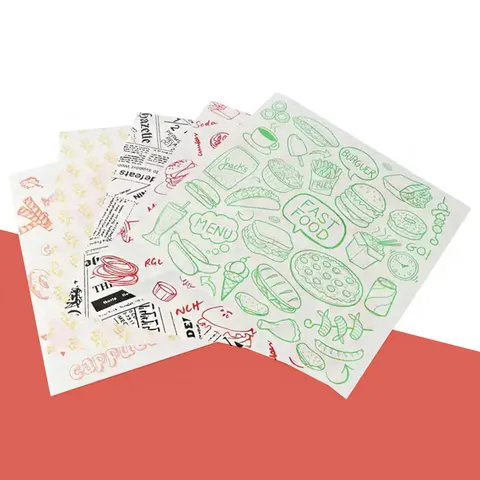 Custom Printed Deli PaperFrom $0.30 a sheet12 x 12 in. · 12 x 15 in. · 15 x 15 in.Sandwiches, burgers, counter service and tray lining with a logo or pattern
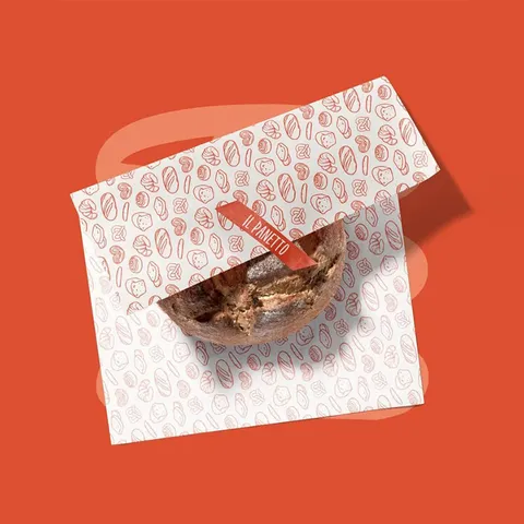 Sandwich Wrap PaperFrom $0.30 a sheet12 x 12 in. · 12 x 15 in. · 15 x 15 in.Deli sandwiches, subs, bagels and wraps
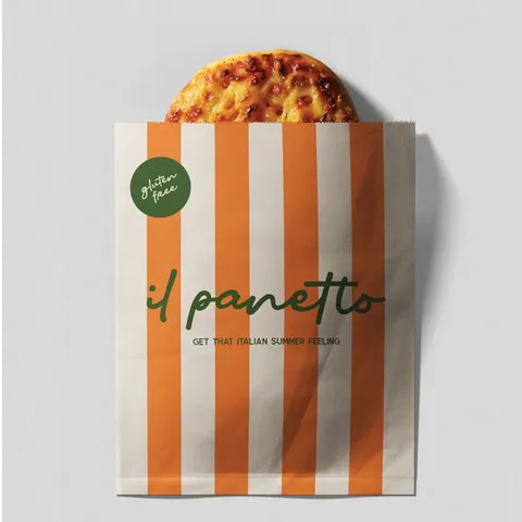 Printed Paper Food BagsFrom $0.30 a sheet6 x 8 in. · 7 x 9 in. · 8 x 12 in.Bread, sandwiches, cookies and takeout items with a printed bag
Questions About This Guide
The questions we answer most weeks. Pick a topic, open a row.
What file format is best for deli paper artwork?
A vector PDF, AI or EPS with text outlined. A transparent PNG works for a one-color mark, and a photo of your sign is enough for a free redraw of a simple wordmark.
Why does the proof thicken the lines in my logo?
Deli paper is absorbent, so hairlines spread and break. We thicken thin strokes so they print as solid lines, and the proof notes every change so you can approve or adjust it.
Can my deli paper artwork include a tagline under the logo?
It can, but on a repeat the tagline prints small and often blurs. Set it in a heavy weight and larger than usual, or keep the tagline for the sign and print the mark alone.
Do I need to build the repeat pattern myself?
No. Send the single logo and we build the staggered repeat and show the spacing on the proof. If you prefer to supply a tile, send it as a vector with matching edges.
How do I send a brand color for deli paper printing?
A Pantone number is best, then a printed sample such as a business card. A color from a screen is the least reliable because screens differ.
Will my artwork look different on kraft than on white?
Yes. Dark colors print warmer and darker on kraft, pale colors go muted, and full color is not offered. The proof is rendered on your chosen stock so the shift is visible.
How many rounds of proof changes are free?
All of them. Changes are free until you approve the proof in writing, and printing does not start until then.
Is there a charge for redrawing my logo from a photo?
No. A simple wordmark or plain symbol is redrawn free from a photo of your sign or menu, and the vector is yours to keep after approval.
What if the printed sheets differ from the approved artwork proof?
That is a misprint. Send photos within 10 days of delivery and the run is reprinted or refunded.
Does artwork approval change the delivery date?
Yes. The 4 to 6 business day production clock starts at written approval, with free tracked US delivery in 2 to 3 business days after that. A late approval moves the whole schedule.
Tell us about your order
Send the product, a sheet size and roughly how many sheets you go through in a month. We reply in writing within one business day with a price and a free design proof. Prefer to talk? Call (503) 461-4788 or message us on WhatsApp.
- Minimum order 1,000 sheets
- Production in 4–6 business days after you approve the proof
- Free tracked delivery in the US in 2–3 business days
- Food-safe soy and water-based inks